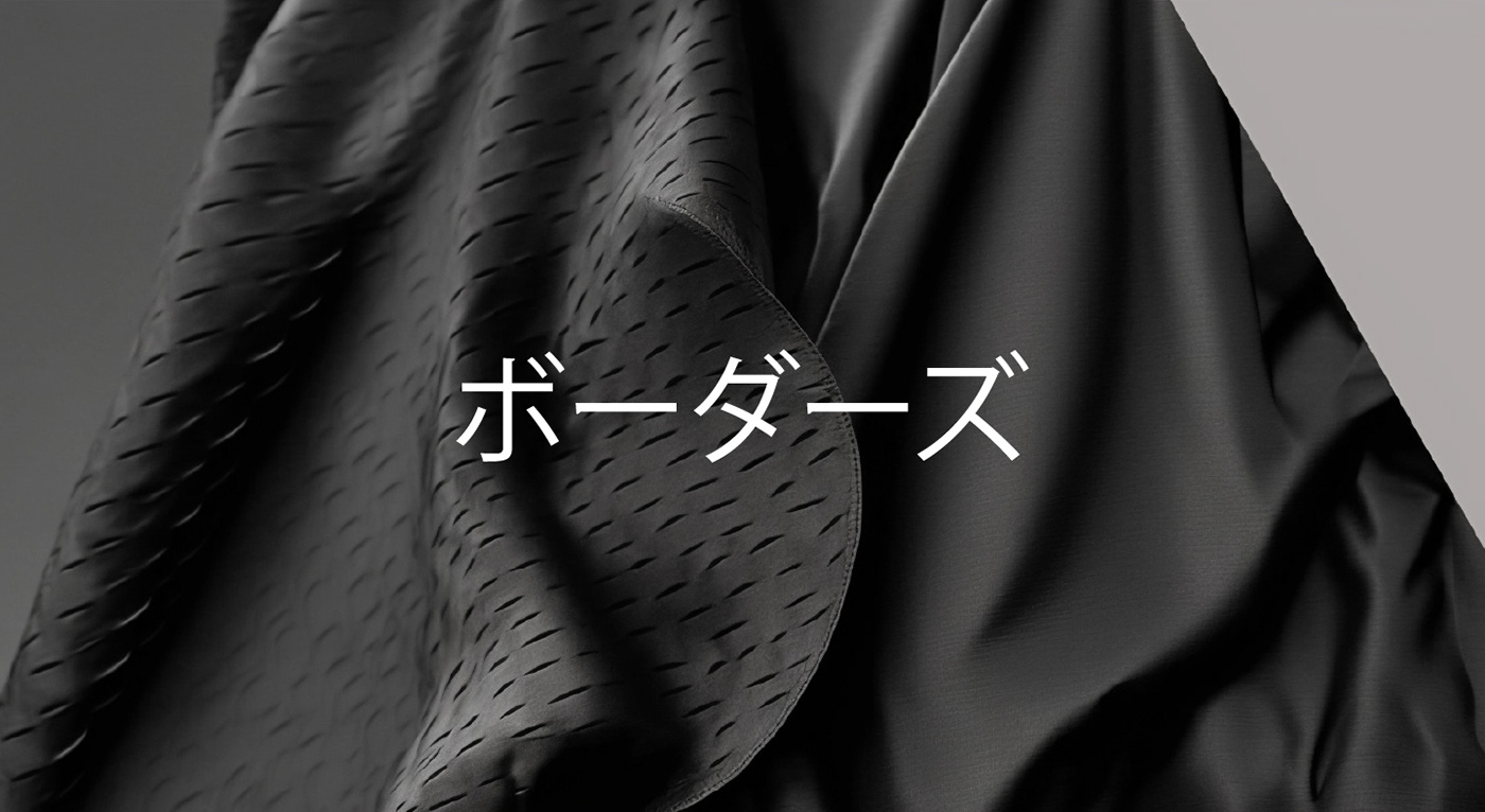
The borders is a brand of youth clothes, shoes and accessories. The brand aims to produce unique images, which will help to stand out and emphasize individuality.
The borders is about catwalk accessible clothing with exclusive cuts and materials. The uniqueness of the concept lies in the use of artificial intelligence in all processes of the project.
As part of the brand identity development I made a brand strategy, which included: analysis of the target audience and competitors; definition of the brand mission and values; definition of business and product strategies; construction of the brand platform and pyramid. The obtained data formed the basis of the concept of corporate identity of the new brand.

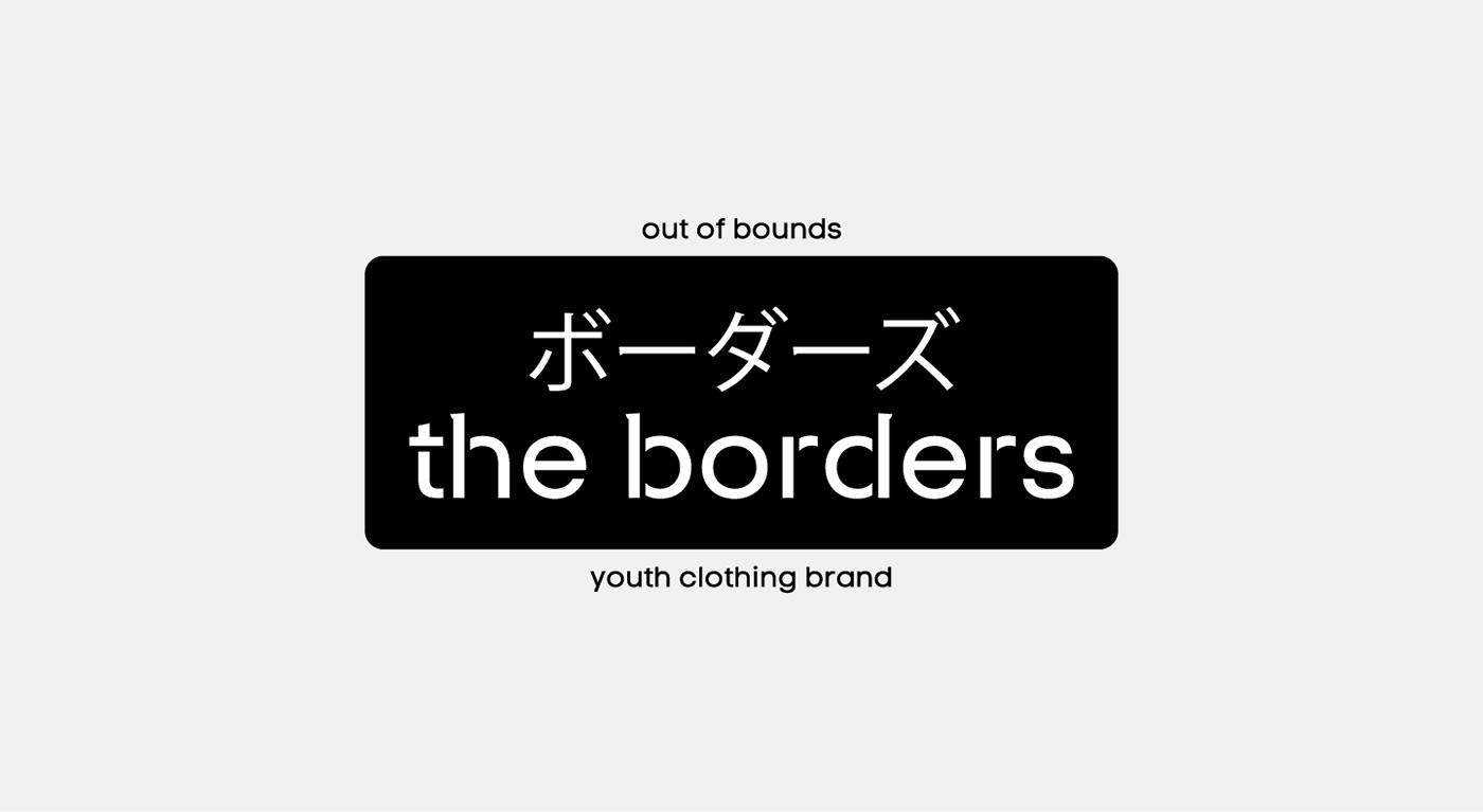
The corporate identity for the brand of youth clothing, shoes and accessories is based on the metaphor of the line as a boundary. In translation, Borders means boundaries - the lines that separate certain things. They divide cities and countries, divide people's views. Borders can exist as stereotypes that prevent people from being themselves, from expressing themselves. In today's world, a person feels a lot of pressure due to the limitations that exist. That is why it is important for today's young person to express himself ecologically. So the slogan "Out of bounds the borders" was born. The brand was created for those who want to be outside of bounds and restrictions. For those who want to break the usual boundaries to be closer to themselves.


Designer: Sabina Mansurova
Client: The borders
Year: 2023
Client: The borders
Year: 2023
Photo: Artificial Intelligence
Fonts: Code Pro LC Regular by designer Svetoslav Simonov. Kozuka Gothic Pr6N by designer Masahiko Kozuka (小塚昌彦). Century Gothic Regular, based on the Monotype 20th Century, which was drawn by Sol Hess.
Fonts: Code Pro LC Regular by designer Svetoslav Simonov. Kozuka Gothic Pr6N by designer Masahiko Kozuka (小塚昌彦). Century Gothic Regular, based on the Monotype 20th Century, which was drawn by Sol Hess.


